EDR Experts Insiders Edition II: Our Branding
Now I thought this may be an interesting one.
In the second edition of our insiders blog, I'll talk about our branding. Or in other words, what makes us - us.
Branding is a critical aspect of a business that involves creating a unique identity that sets it apart from its competitors.
It serves as a comprehensive framework that establishes a standard for the visual and perceptual identity a brand presents to its potential customers. This entals colors, logos, brochures, typography, motion graphics, and all other elements, ranging from the website to brochures, and even invoices.
Branding is crucial for businesses of all sizes, but it becomes doubly significant for a software/services business that operates solely online, without any physical storefronts. The entire perception of our business hinges on the impression our website makes.
When creating the branding framework, I set a few key goals that it had to cover:
- Trustworthiness - every small detail of our branding and experience should inspire trust and confidence. This is of utmost importance in the cyber-security space.
- Beauty and simplicity -- our branding must be visually striking yet not overly complex. In 2024, it's unnecessary for a business to create an entire fantasy world for the user experience. We aim to distinguish ourselves without going overboard, true to the adage of not over-egging the pudding.
- No boring stuff -- incorporating elements like motion into the entire branding and experience serves as an excellent icebreaker.
- Professionalism -- everything we do should have a highly professional look, whilst also...
- Not taking ourselves too seriously -- there is no need to go "big corporate" on our experience -- we are not a law firm or a major bank.
- A user-centric, humanistic, and authentic approach that remains modern and futuristic, ensuring it withstands the test of time.
Now let's go over key points of our framework and discuss how the goals above were achieved.
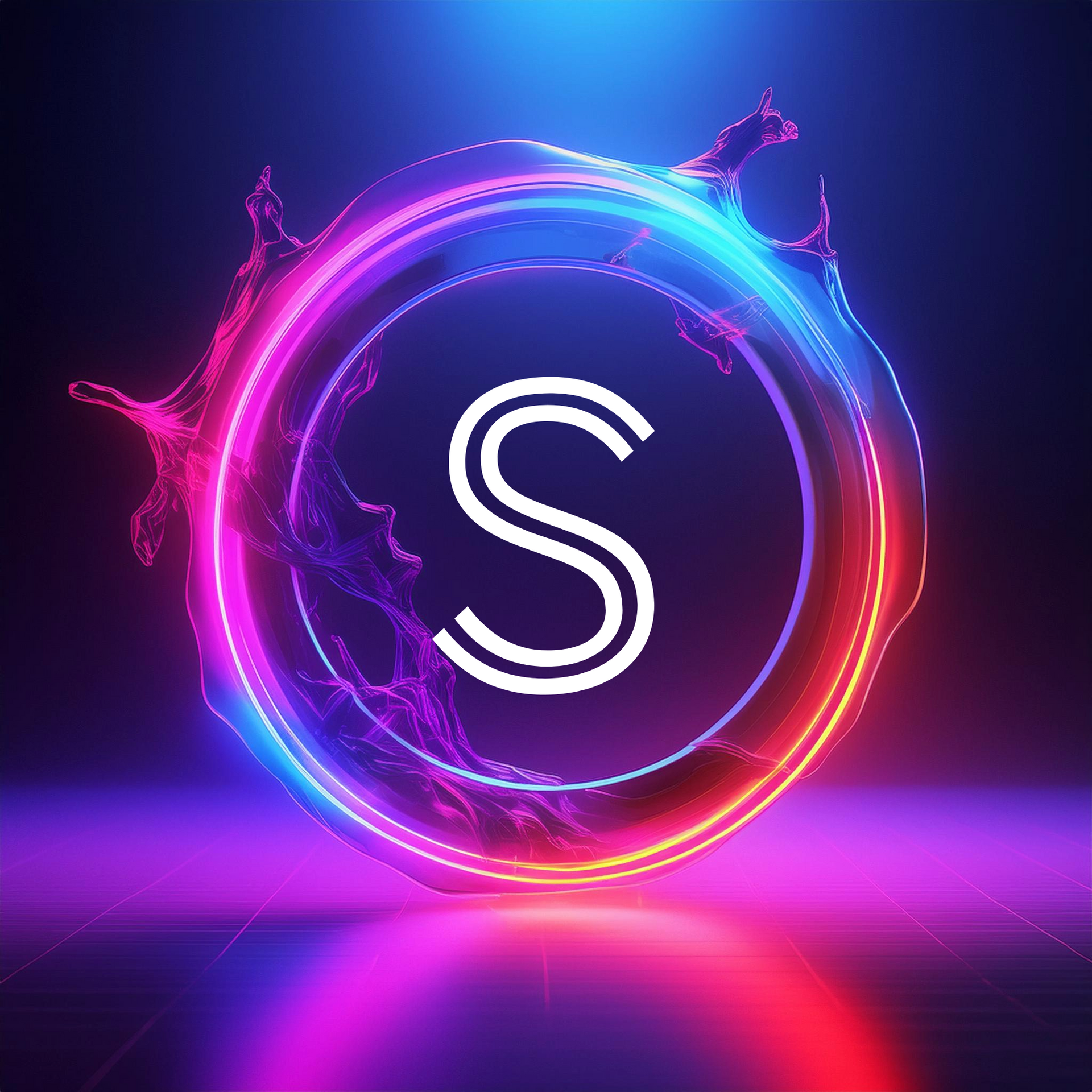
Our logo

Our logo conveys an entire visual narrative. It features crisp lines and incorporates intelligent use of lighting—observe the gradients on the blue and red sections as they reverse. The two colors merge flawlessly at the center of a prominent Sigma symbol, which also bears a resemblance to an uppercase 'E'. The letter itself is gradient too, introducing a third color, purple, into the mix, adding a touch of excitement.
The choice of colors is intentional; blue is recognized as the most trustworthy color, while red signifies passion. Our passion is reflected in what we do. The lower half of the Sigma symbol signifies growth, akin to a mountain, symbolizing our readiness to ascend and expand. The complete Sigma symbol embodies precision, a crucial aspect in managing an Enhanced Detection and Response solution.
Fun fact: the logo was designed on Apple Keynote!
Our typography
After experimenting with various fonts, two particularly resonated with the clean, rounded lines of the logo: Barlow and Ubuntu. Barlow conveys a sense of seriousness (again, not being too corporate like Arial, Times New Roman, and others), while Ubuntu, which is also the default font for operating system with the same name, embodies humanity—in fact, that's what Ubuntu means. Barlow remains used throughout the whole website, whilst the Ubuntu font comes into play where actions need to be taken -- for example as a button label.
Our imagery
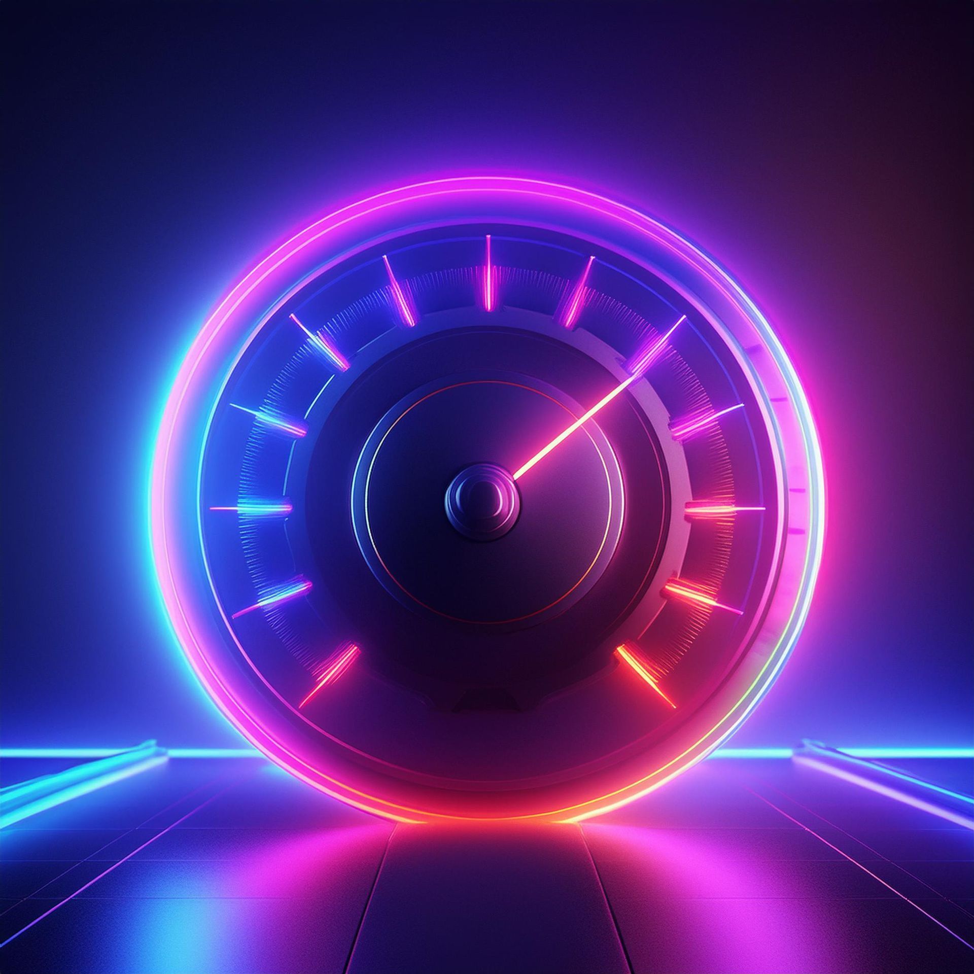
Our imagery is divided in 4 segments:
- Futuristic -- spotting neon lights and light smoke, containing the 2 key colors we've already established.
- Animated -- frequently spotting people.
- Humanistic -- real people
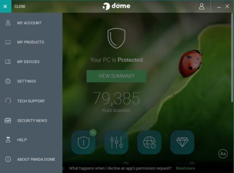
- Nature-inspired -- blue and red represent trust, but also look like water and fire. Throughout some parts of the website, we use real nature photographic images, to promote a peaceful experience. Even though throughout every part of our experience copy/paste was highly undesirable, two cybersec vendors (potentially even more) beat us to using nature themes. This is Panda, that's been using a rotation of natural photographic imagery in the main UI for a number of years now and McAfee (Trellix) has been using a green, grass-like wallpaper at the top part of their main UI for at least 10 years.

Much of this imagery was created internally, adding a sense of excitement, tranquility, and simplicity to our overall aesthetic.
The website pages
The web pages feature dynamic motion, playfully encouraging users to delve into and discover more about the products and services we provide. The overall look of pages is tweaked to be easier on the eyes, as well as highly optimized for mobile devices. It reveals a rather user- and content-centric approach. For example, the navigation bar on desktop devices becomes smaller upon scrolling down, paving the way for the main parts of the website.
Our tone is frequently quite spicy, which eliminates hints of dullness, ensuring that readers are engaged and eager to read on.

That's about it.
I hope the story of our branding was an interesting read. In the previous blog post we discussed why EDR Experts was found and in the next one, we will get a bit more technical. We'll have a look on who our partners are and why we've decided to work with them. Stay tuned.